If you were to write a graph in python, what would you use?
Most people use "matplotlib", but it basically just displays the graph and that's it.
You may think it's obvious, but the beauty of Plotly is that even after you've drawn the graph, you can zoom in on the areas you want to focus on, hover the cursor over each plot point, and read the data intuitively !
I've been writing an article about Plotly every Thursday, but as the number of articles has increased, I'm going to summarize them on this page so that you can use them as a basis for your reading !
For first time Plotly users
① What is Plotly? + A data-free tutorial
This article explains what Plotly is and how to use it. to a simple tutorial, so it's recommended for first-time users!

② For those who want to know what graphs can be drawn with Plotly
This article not only describes the graphs that can be drawn with Plotly, including examples of how to draw them, but also provides links to pages that describe the details of how to draw each graph, so if you bookmark this article, it will be useful when you want to draw graphs!
If you are a new user, it is enough to read this article and think, "I can draw graphs like this? If you are a new user, it's enough if you read it and think, "I can draw graphs like this!
③ Things to keep in mind when using Plotly !
Even though there are many different types of graphs, there are some common aspects of the way they are coded. This is an article that summarizes those common parts!

Tips on how to use Plotly
If you can use this, you will be able to use Plotly better! I'm going to summarize the articles that explain the features of Plotly !
① How to save a graph
In addition to the PNG image format, there is also a way to save the graph as HTML in a movable format, which is quite useful and one of the features you should keep in mind!
② subplot function (display graphs side by side)
With this, you can neatly display multiple graphs side by side!
This is a feature that matplotlib also has, and one that I want when I have multiple graphs that I want to compare together!
③ Set axis labels (Axis 2 and above)
For example, if you want to write more than one graph with different units such as temperature and precipitation, you need to set more than one axis label. In this article, I summarize the settings for such a case, and I think it would be good to keep it in mind as well, since it is a function that utilizes the same "make_subplot" as subplot above!
Plotly : List of graphs
In light of the graphs and sample code, I've summarized them here (List of graphs you can draw with Plotly !), so I'll give a brief summary here!
Graphs drawn by setting the corresponding values for the X and Y axes
(1) Line plot
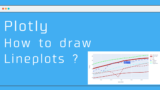
(2) Scatter plots and line graphs
Pie chart
(1) Pie chart

(2) Sunburst chart

Hierarchical graphs
Since the data structure itself is the same and only the way it is drawn as a graph is different, you can draw all three types of graphs with very little code change !
(1) Sunburst chart
Plotly : How to Draw Sunburst Charts ~ The Definitive Guide to Pie Charts! ~
(2) Tree map

(3) Icicle chart

Table
(1) go.Table

Other diagrams
(1) violin plot
(2) Heatmap

Solving questions that have been bothering you !
① What is graph objects ?
In this blog, I mainly use plotly.graph_objects, but there is also plotly. Express, so I decided to write an article about it.

② What is Express?
This article is a sequel to the one above, with the main focus on the Express side!