
When you want to visualize data with a hierarchical structure, you want to keep the hierarchical connections, but if you put them all together, the graph becomes too detailed and difficult to read...
Plotly is an application that allows you to create a graph of your data.
Plotly allows you to draw graphs with both of these in mind!
Plotly offers the following three ways to visualize data with a hierarchical structure!
- Sunburst Charts (Plotly : How to Draw Sunburst Charts ~ The Definitive Guide to Pie Charts! ~)
- Treemap Charts (Visualize hierarchical data with Plotly Tree map!)
- Icicle Charts (I'll summarize in this article!!)
So far, we have summarized two graphs, and in this article, we will summarize the third one, Icicle Charts, which is newly added in version 5.0 of plotly!


What is Icicle Charts ?
Icicle Charts are one of the diagrams used to visualize data with a hierarchical structure as the hierarchical branching resembles an icicle.
- Sunburst Charts : Circle
- Treemap : Rectangle (encapsulated type)
- Icicle Charts : Rectangle
Icicle Charts is similar to Sunburst Charts in that it looks like a pie chart transformed into a straight line (rectangle) and the child elements are drawn outside the parent element! On the other hand, in Treemap, the child elements are drawn inside the parent element, which is different from Icicle Charts, which has the same rectangular visualization!
By the way, this graph is a new feature in version 5 of plotly, released in June 2021!
How to draw Icicle Charts : Basic
To visualize hierarchical data, we need three types of information: labels, parents, and values.
This is the same for both Sunburst Charts and Icicle Charts, except for Treemap!
And the best part about drawing graphs is that they are almost the same!
Rather, you can draw them with the exact same code, except you specify the chart after "go. If you remember this, you can draw three different graphs by just mastering how to draw one, which is a great deal!
go.Icicle( labels="List of labels to be classified",
      parents="List of parent labels",
      values="List of values")
The difference between this and a pie chart is that you need a column with a parent label, and you need to define the root element. It's not difficult to do, so I'll explain it in order using an example!
① Define the data frame for drawing
#  Create a df with label, parents, and value (in this case, pop(population) is the value we want to draw in the graph).
df = pd.DataFrame(columns={'labels','parents','pop'})
② Definition of roots
Group the parent elements together using groupby, and do not set anything for the top-level element's parents (assign "")
# Organize parent elements by groupby
df_2007_continent = df_2007.groupby('continent').sum().reset_index()
# Do not set anything to the top-level element's parents (assign "")
df_2007_continent['parents'] = ""
# Rename the continent column as label to labels and join it to the df for drawing.
df_2007_continent = df_2007_continent.rename(columns={'continent':'labels'})
df = pd.concat([df,df_2007_continent[['labels','parents','pop']]])
③ Definition of the child element
If it's not the lowest layer, do gropuby to get the sum and add it to the df for drawing, if it's the lowest layer, rename it to fit the df and concat it to the df.
# Rename the country column to labels and the continent column to parents, and merge them into a df for drawing.
df_2007 = df_2007.rename(columns={'country':'labels','continent':'parents'})
df = pd.concat([df,df_2007[['labels','parents','pop']]])
How to draw Icicle charts Application
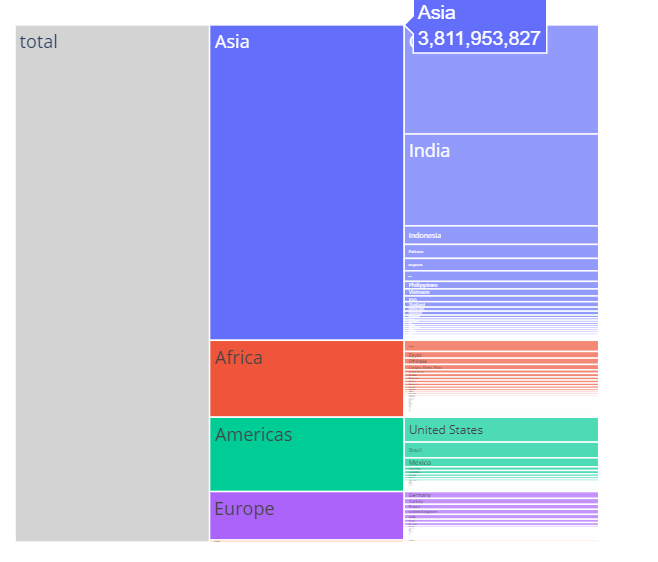
root_color
As for the background color setting for the root section, the default setting is a whitish color that blends in with the background, making it difficult to see. Therefore, I recommend changing the color to "lightgray". That's how I've set it in the figure above, and it makes the graph much easier to read!
branchvalues (setting the width of a child element)
-
total (see the graph given in the example here) The width of a child element is determined solely by the percentage of the parent element it contains (the parent's width is the sum of the child's widths).
-
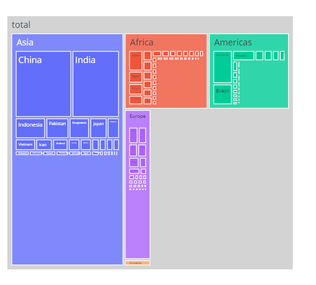
remainder (default) The width of the parent is the sum of the widths of the children plus the width of the parent, that is, the sum of the widths of the children is at most half the width of the parent. By the way, if you draw the above graph by default, it will look like the figure below.
Sample code
import pandas as pd
import plotly.express as px
import plotly.graph_objects as go

df = px.data.gapminder()
df_2007 = df[df['year']==2007]
df_2007_continent = df_2007.groupby('continent').sum().reset_index()

df = pd.DataFrame(columns={'labels','parent','pop'})
df_2007_continent['parent'] = "total" # The parent of each continent is set to total
df_2007_continent = df_2007_continent.rename(columns={'continent':'labels'})
df = pd.concat([df,df_2007_continent[['labels','parent','pop']]])
df_2007 = df_2007.rename(columns={'country':'labels','continent':'parent'})
df = pd.concat([df,df_2007[['labels','parent','pop']]])
# Add a line for totals
df = df.append({'labels':'total','parent':'', 'pop':df_2007_continent['pop'].sum()},ignore_index=True)

fig =go.Figure(go.Icicle(
    labels=df['labels'],
    parents = df['parent'],
    values = df['pop'],
    branchvalues="total",
    root_color="lightgrey"
))

fig.show()
