
In this article, I will briefly summarize the illustration of time series data, and then summarize it as "Plots for Time Series Analysis" in three articles.
- Plotting Time Series Data (Plotly) Basics of plotting time series data, not limited to financial data (this time!)
- Switching plots by buttons
- (Practical) How to draw financial plots Candle Stick, OHLC Chart
Data used in this article
In this article, I'll use GAFA and other giant corporations' stock price movements as examples!
The library and data preparation is as follows.This is relative to the stock price on January 1, 2018, which is 1.0.
import pandas as pd
import plotly.express as px
import plotly.graph_objects as go
df = px.data.stocks()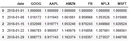
Basics of Time Series Graphs
Line Plot
It's easy to draw!
As is the case with all graphs, including line graphs, even time series data can be drawn by simply setting the column representing the date as the x-axis!
# Line plot of Apple stock price
fig = go.Figure([go.Scatter(x=df['date'], y=df['AAPL'])])
fig.show()
Bar Plot
The basic idea is the same as the line chart, but with a twist: I'm going to write it so that it can also show negative values!
By subtracting 1 from all the values, we can easily show the negative and positive values from the base stock price of 1/1/2018!
# Apple's stock price bar chart
# Subtract 1 from the whole, drawing a negative value when it goes down
df = px.data.stocks(indexed=True)-1
fig = go.Figure()
fig.add_trace(go.Bar(x=df.index, y=df['AAPL']))
fig.show()
Recommendations to remember!
Range Slider
You'll notice a small graph has been added below the main one!
As you can see, if you limit or expand the range in the main graph, you can still add a range slider that will show you what part of the whole you're representing, just by drawing this one line!
fig.update_xaxes(rangeslider_visible=True)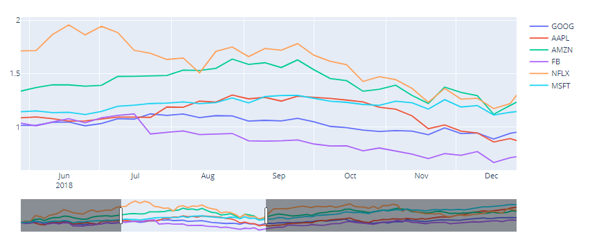
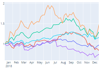
Editing the x-axis display (month-by-month display)
By default, the x-axis will not be displayed for each month as shown in the upper figure, but if you want to display it for each month as shown in the lower figure, you can do so by setting the following!
fig.update_xaxes(
    dtick="M1",
    tickformat="%b\n%Y",
    ticklabelmode="period")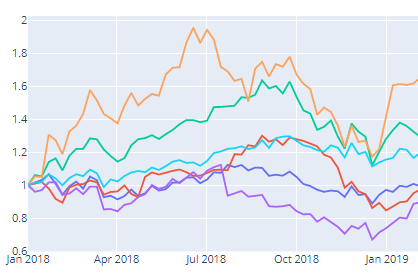
Graph
If we put all this together and draw a graph, we can draw something like the figure below!
Sample Code
The functions presented so far can be executed with the program below!
fig = go.Figure()
for company in df.columns[1:]:
    fig.add_trace(go.Scatter(x=df['date'], y=df[company],name = company))
    fig.update_xaxes(
        dtick="M1",
        tickformat="%b\n%Y",
        ticklabelmode="period")
fig.update_xaxes(rangeslider_visible=True) #ranges slider
fig.show()
