In Plotly, you can use the Scatter function to draw a LinePlot! This can be done by setting the option mode to "lines", but for an explanation of mode, etc., please refer to the following blog.
Setting the mode for Plotly Scatter (scatter and line graphs)
In this article, I will summarize the other options available for drawing LinePlot!
Style (Setting Line Styles)
In this section, we will summarize the settings of the "line" option, which is the largest option for LinePlot. First of all, here is a list of possible settings for "line", which are defined as a dictionary type!
go.Scatter(x="x-values", y="y-values", mode="lines",
           line = dict(option_1 = "",
                       option_2 = "",
                             ・・・
             option_n = "")
)- color : polyline color
- width:Width thickness
- dash:Line shape (e.g. dashed line)
color
There are two main ways to specify the color.
Specify by color name
color = 'color_name'
color = 'royalblue'
For the color names here, you can specify any named CSS color as described here

Specified in RGB notation
color = 'rgb(100,150,200)' #rgb(red,green,blue)width
Sets the thickness of the line width. Unit is in pixels.
width = 10 #10(px)dash
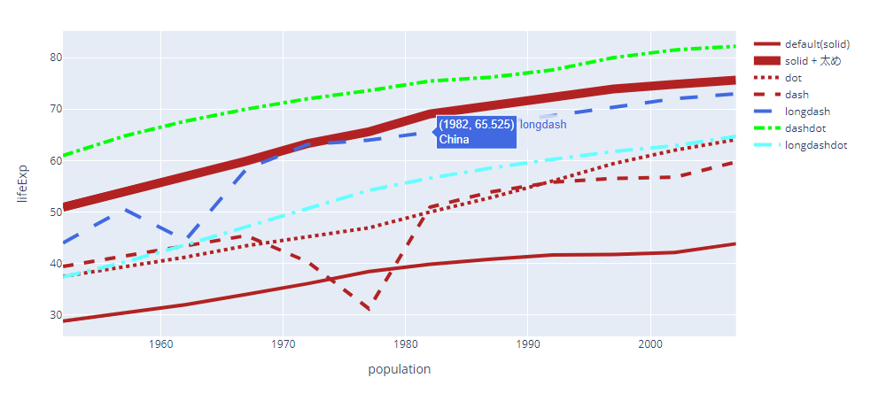
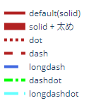
Options for the shape of the line. The default is solid, and other options include dot, dash, longdash, dashdot, and longdashdot.
dash = "dot" Sample Code
Here is the code for the plotly diagram that runs through all of this!
# Data Preparation
import pandas as pd
import plotly.express as px
df = px.data.gapminder()
asia_df = df[df['continent']=='Asia']

# Graph Visualization
import plotly.graph_objects as go
country =  asia_df['country'].unique()
plot_df = asia_df[asia_df['country']==country[0]]

fig = go.Figure()

fig.add_trace(
    go.Scatter(x = plot_df['year'],
               y = plot_df['lifeExp'],
              text = country[0],
              mode = 'lines',
              name = 'default(solid)',
              line=dict(color='firebrick', width=4)
    )
)
plot_df = asia_df[asia_df['country']==country[1]]
fig.add_trace(
    go.Scatter(x = plot_df['year'],
               y = plot_df['lifeExp'],
              text = country[1],
              mode = 'lines',
              name = 'solid + 太め',
              line=dict(color='firebrick', width=10,dash='solid')

    )
)

plot_df = asia_df[asia_df['country']==country[2]]
fig.add_trace(
    go.Scatter(x = plot_df['year'],
               y = plot_df['lifeExp'],
              text = country[2],
              mode = 'lines',
              line=dict(color='firebrick', width=4,dash='dot'),
              name = 'dot'

    )
)

plot_df = asia_df[asia_df['country']==country[3]]
fig.add_trace(
    go.Scatter(x = plot_df['year'],
               y = plot_df['lifeExp'],
              text = country[3],
              mode = 'lines',
              line=dict(color='firebrick', width=4,dash='dash'),
              name = 'dash'
    )
)
plot_df = asia_df[asia_df['country']==country[4]]
fig.add_trace(
    go.Scatter(x = plot_df['year'],
               y = plot_df['lifeExp'],
              text = country[4],
              mode = 'lines',
              line=dict(color='royalblue', width=4,dash='longdash'),
              name = 'longdash'

    )
)

plot_df = asia_df[asia_df['country']==country[5]]
fig.add_trace(
    go.Scatter(x = plot_df['year'],
               y = plot_df['lifeExp'],
              text = country[5],
              mode = 'lines',
              line=dict(color='rgb(0,255,0)', width=4,dash='dashdot'),
              name = 'dashdot'
    )
)

plot_df = asia_df[asia_df['country']==country[6]]
fig.add_trace(
    go.Scatter(x = plot_df['year'],
               y = plot_df['lifeExp'],
              text = country[6],
              mode = 'lines',
              line=dict(color='rgb(100,255,255)', width=4,dash='longdashdot'),
              name = 'longdashdot'
    )
)

fig.update_layout(
    xaxis_title = 'population',
    yaxis_title = 'lifeExp'
)

fig.show()
line_shape
The default in lineplot is to draw a line graph with straight lines connecting the points. But there are other ways to connect points, and these can be set with line_shape.
The types are as follows
- linear(default)
- spline
- hv
- vh
- hvh
- vhv
Sample Code
The data preparation part is the same as in the sample code above.
# Graph Visualization
import plotly.graph_objects as go
country =  asia_df['country'].unique()
plot_df = asia_df[asia_df['country']==country[0]]

fig = go.Figure()

fig.add_trace(
    go.Scatter(x = plot_df['year'],
               y = plot_df['lifeExp'],
              text = country[0],
              mode = 'lines+markers',
              name = 'default(linear)',
    )
)
plot_df = asia_df[asia_df['country']==country[1]]
fig.add_trace(
    go.Scatter(x = plot_df['year'],
               y = plot_df['lifeExp'],
              text = country[1],
              mode = 'lines+markers',
              name = 'spline',
              line_shape='spline'
    )
)

plot_df = asia_df[asia_df['country']==country[2]]
fig.add_trace(
    go.Scatter(x = plot_df['year'],
               y = plot_df['lifeExp'],
              text = country[2],
              mode = 'lines+markers',
              name = 'hv',
              line_shape = 'hv'
    )
)

plot_df = asia_df[asia_df['country']==country[3]]
fig.add_trace(
    go.Scatter(x = plot_df['year'],
               y = plot_df['lifeExp'],
              text = country[3],
              mode = 'lines+markers',
              line_shape = 'vh',
              name = 'vh',
    )
)
plot_df = asia_df[asia_df['country']==country[4]]
fig.add_trace(
    go.Scatter(x = plot_df['year'],
               y = plot_df['lifeExp'],
              text = country[4],
              mode = 'lines+markers',
              name = 'hvh',
              line_shape = 'hvh'
    )
)

plot_df = asia_df[asia_df['country']==country[5]]
fig.add_trace(
    go.Scatter(x = plot_df['year'],
               y = plot_df['lifeExp'],
              text = country[5],
              mode = 'lines+markers',
              name = 'vhv',
              line_shape = 'vhv'
    )
)

fig.update_layout(
    xaxis_title = 'population',
    yaxis_title = 'lifeExp'
)

fig.show()