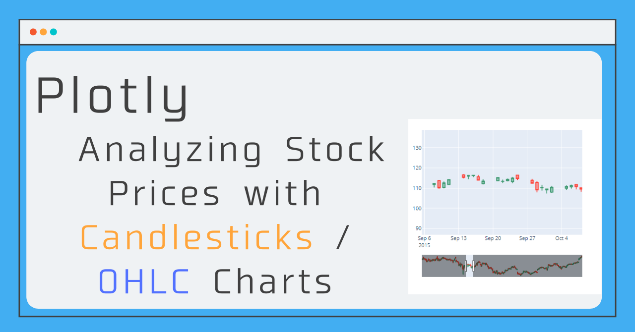
So far, I have been writing articles on points that are important to remember when plotting time series data. In this article, as the last in the series, I will show you how to plot candlestick charts and OHLC charts, which are also used to monitor stock price trends!
- Plotting Time Series Data (Plotly) : Basics of plotting time series data, not just financial data
- How to switch between frequently used analyses with a button! (Range Selector)
- (Practice) How to draw financial plots Candle Stick, OHLC Chart : (This time !)
To read the previous articles, click here!


Data used in this article
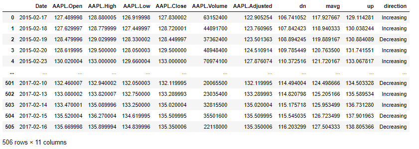
In this article, I'll use data from Apple's daily stock quotes to summarize!
Preparation of the library and data to be used is as follows.
import pandas as pd
import plotly.graph_objects as go
df = pd.read_csv('https://raw.githubusercontent.com/plotly/datasets/master/finance-charts-apple.csv')
A brief description of the columns
- Date
- APPL.Open : The price at the beginning of the day (opening price)
- APPL. High : Most expensive price (high price)
- APPL. Low : Lowest price (low price)
- APPL. Close: Last price of the day (closing price)
Candlestick Charts
What is a candlestick chart ?
The candlestick chart, which originated in Japan and is also widely used overseas, is said to have originated in the Edo period.
A candlestick is a chart that is drawn using the four values of the opening, high, low, and closing prices within a certain interval. The shape is similar to a box-and-whisker diagram! In a box-and-whisker diagram, the "box" is the value from the opening price to the closing price, and the low and high prices are drawn outside the box as the "whiskers".
In addition, depending on whether the opening price or the closing price is higher, the color of the graph is changed, so it can be analyzed at a glance and is one of the most useful graphs.
How to draw with Plotly
In graph_object, there is a method that can write a candlestick chart, so we will use it and take the time series data as an argument and the above four values as the others.
The basic writing style is as follows
fig = go.Figure()
fig.add_trace(go.Candlestick(
x=df['Date'], # Time series data (daily in this case)
open=df['AAPL.Open'], # opening price
high=df['AAPL.High'], # high price
low=df['AAPL.Low'], # low price
close=df['AAPL.Close'])# closing price
)
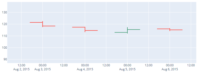
fig.show()If you actually draw a graph, it will look like the one below!
When you look at the whole picture, it's hard to see the whiskers, but if you zoom in, you'll see that the box and whisker areas look good!
OHLC charts
What is OHLC charts?
OHLC stands for Open, High, Low, and Close, which correspond to the opening, high, low, and closing prices of the candlestick chart, respectively. As the name implies, the chart is similar to a candlestick chart, but the way it is displayed is different.
The OHLC chart is unique in that it shows the opening and closing prices by extending the line from the high to the low to the left and right, instead of the box and whiskers of the candlestick chart.
How to draw with plotly
Since the arguments required for the candlestick chart are the same as for the candlestick chart, we can also write an OHLC chart by simply changing the method name from go.Candlestick to go.Ohlc!
fig = go.Figure()
fig.add_trace(go.Ohlc(
                x=df['Date'], # Time series data (daily in this case)
                open=df['AAPL.Open'],  # opening price
                high=df['AAPL.High'],  # high price
                low=df['AAPL.Low'],    # low price
                close=df['AAPL.Close'])# closing price
             )
fig.show()
Options (Applications)
So far, I have summarized the basic ways to draw candlestick charts and OHLC charts, but I will now summarize the applications of the graphs common to these!
Hide the Range Slider
The RangeSlider, which was introduced in article Plotting time-series data (Plotly) , plays a role in making it easier to grasp the whole picture even when the main graph is enlarged, but this feature is turned on by default for candlestick and OHLC charts.
If you want to hide it, you can do so by adding the line below! (This is the same statement as for display, only you are switching between showing and hiding depending on whether rangeslider_visible is True or False!)
fig.update_xaxes(rangeslider_visible=False)Change color
You can set the color for opening price < closing price as increasing_line_color and You can set the color for opening > closing as decreasing_line_color
increasing_line_color= 'red', decreasing_line_color= 'gray'Sample code
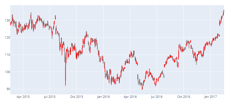
# These two are common to CandleStick, OHLC

# rangeSlider None
# Color setting for ascending and descending
fig = go.Figure()
fig.add_trace(go.Candlestick(
                x=df['Date'],
                open=df['AAPL.Open'],
                high=df['AAPL.High'],
                low=df['AAPL.Low'],
                close=df['AAPL.Close'],
                increasing_line_color= 'red', decreasing_line_color= 'gray'
                )
             )
fig.update_xaxes(rangeslider_visible=False)
fig.show()