In time series analysis, you want to check the trend in this range in particular! I'm sure you have a range that you want to check.
For example, the most recent week, the most recent month, this year, and so on. It would be convenient if you could switch between these with the touch of a button, instead of having to specify a range each time! So today, I'll summarize how to use buttons to switch between ranges!
- Plotting Time Series Data (Plotly) : Basics of plotting time series data, not limited to financial data
- Switching plots by buttons (this time!)
- (Practical) How to draw financial plots Candle Stick, OHLC Chart
Read the previous post here!

Data used in this article
In this article, I'll use GAFA and other giant corporations' stock price movements as examples!
The library and data preparation is as follows.This is relative to the stock price on January 1, 2018, which is 1.0.
import pandas as pd
import plotly.express as px
import plotly.graph_objects as go
df = px.data.stocks()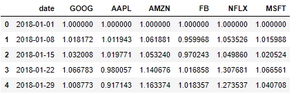
range_selector
The graph we will make
Put a button on the graph so that you can change the range by manipulating this button!
Actually, try to see how the range changes while pressing the button!
Basic Structure
This time, we'll combine the Range Selector to select a range with a button!
We'll use "update_xaxes" to set up the x-axis, and set up the rangeselector as a dictionary type and the buttons as dictionary type lists!
fig.update_xaxes(
    rangeslider_visible=True,
    rangeselector=dict(
        buttons=list([
            dict(count=1, label="Last one month", step="month", stepmode="backward"), # Button one
        ])
    )
)
Details of the button settings
The part directly related to the button will be the contents of this dict, so I will explain the elements in this dict in detail!
dict(count=1, label="Last one month", step="month", stepmode="backward"), # Button1count
There is a strong relationship with step, which will be introduced later, and the range will be specified by the unit specified by step × count!
(Example) : If step = 'month', count = 2, then 2 x month (months) = 2 months of range
label
Specify the text to be displayed on the button.
step
Determine the units that will be used to determine the range.
- year
- month
- day
- hour
- minute
- second
- all : To create a button to show all without specifying a range
stepmode
"backward" and "rotate" can be set, allowing different range settings.
- backward : Set the range backward from the most recent date (e.g., most recent month, most recent year)
- todate : Set the beginning of the range to the first timestamp (e.g., if step="year", start on January 1)
Sample code
The code to draw the graph we've put together is as follows!
# Changes in Amazon's stock price

fig = go.Figure()
df_plot = df[df['date']<'2019-10-23'] # Narrow it down to values up to 10/23/2019
fig.add_trace(go.Scatter(x=df_plot['date'], y=df_plot['AMZN']))

fig.update_xaxes(
    rangeslider_visible=True,
    rangeselector=dict(
        buttons=list([
            dict(count=1, label="直近1ヶ月", step="month", stepmode="backward"), # Last 1 month
            dict(count=2, label="今月", step="month", stepmode="todate"), # This month
            dict(count=6, label="直近6ヶ月", step="month", stepmode="backward"), # last six months
            dict(count=1, label="今年", step="year", stepmode="todate"), # This year
            dict(count=1, label="直近1年", step="year", stepmode="backward"), # Last year
            dict(step="all")
        ])
    )
)
fig.show()