Let's visualize the correlation matrix!
This is the first time I've used a correlation matrix.
By the way, if you represent it as tabular data, it will look like the figure below, but are you using matplotlib or seaborn to visualize it? This task can also be done in Plotly!
In this article, I will summarize how to use heatmaps in Plotly.
Heatmap (graph_objects)
First, let's look at how to use Heatmap with graph_objects.
Basic
- After add_trace, you can draw heatmaps by using go.Heatmap instead of go.
- Argument z : The basic idea is to store the values represented on heatmap in a two-dimensional array.
Display it according to the x,y coordinates on the 2D array.
import plotly.graph_objects as go

fig = go.Figure()
fig.add_trace(go.Heatmap(
                    z=[[1, 100, 3],
                      [100, 1, 20],
                      [60, 50, 1]]))
fig.show()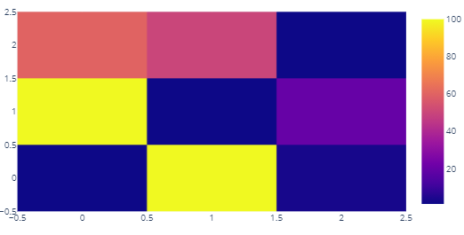
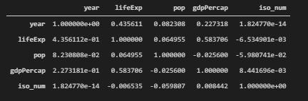
Create a heat map of the correlation matrix
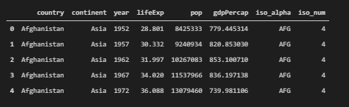
From the sample data provided by plotly, we will consider the average life expectancy data by country/region here.
In the basic writing section above, only the z value was specified as an argument, but it is also possible to set labels for the vertical and horizontal axes (x,y).
If the data frame is called df
x-axis : x = df.columns
y-axis : y = df.index
z : z = np.array(df)
If you set it up like above, you won't have to write different code for different cases!
import pandas as pd
import plotly.express as px
import plotly.graph_objects as go
import numpy as np

df = px.data.gapminder() # Data Preparation
df_corr = df.corr() # Generate correlation matrix

fig = go.Figure()
fig.add_trace(
    go.Heatmap(
        x = df_corr.columns,
        y = df_corr.index,
        z = np.array(df_corr)
    )
)
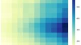
Display additional numbers and letters on the heatmap (figure_factory)
Now we can create a heat map from data stored in a dataframe or 2D array! Due to the nature of Plotly, you can see the value of a square when you hover over it. However, it is often easier to display the values on the heatmap.
In this section, we will explain how to add text display using figure_factory.
As for data, we continue to use data on average life expectancy by country and region, as shown in the figure below.
Putting the numbers in makes it much easier to read, doesn't it!
I'll post the whole code first, and then add explanations for the individual arguments.
import plotly.figure_factory as ff
x = list(df_corr.columns)
y = list(df_corr.index)
z = np.array(df_corr)

fig = ff.create_annotated_heatmap(
    z,
    x = x,
    y = y ,
    annotation_text = np.around(z, decimals=2),
    hoverinfo='z',
    colorscale='Viridis'
    )
fig.show() The basic settings for x, y, and z are the same as in the above example using graph_objects, but
sometimes the settings for x and y are executed as is, and sometimes an error occurs.。
annotation_text
Set the text to be displayed on the heat map.
You can use either text or numbers!
If the values are displayed as they are, the values after the decimal point are also displayed as they are, making it difficult to read. For this reason, the values are displayed up to the second decimal place.
annotation_text = np.around(z, decimals=2),hoverinfo
You can specify the variables to be displayed when you hover the cursor over them.
In the example above, all of x, y, and z would be displayed." It is enough to display only z!" then the following configuration can be implemented.
hoverinfo = 'z'colorscale
You can also set the color scale in displaying the heat map.
- 'Grays' : Monochrome color scale
- 'Virids' : Color scale used in this case
For more information about the color scales available in plotly, see the following page Plotly Heatmap (visualize the correlation matrix as a heatmap)