There are times when you want to use multiple axis labels instead of just one. Here is a summary of how to use it, with code!
In addition, we will use the make_subplots function to set up the graphs, but the main usage of this function (Plotly Display Multiple Graphs Side by Side (make_subplots, set_subplots))is written in a separate article, so please read this article as well!
How to set the second axis label ?
Since plotly.express does not support this functions, we will use plotly.graph_objects in this article to explain it.
Basic structure
The basic flow is as follows.
① import make_subplots
② Set whether or not to show the second axis.
③ Set primary and secondary axes when describing a graph.
① import make_subplots
from plotly.subplots import make_subplots② Set whether or not to show the second axis.
Setting "secondary_y" to True will allow the second axis to be displayed.
fig = make_subplots(specs=[[{"secondary_y": True}]])Optional (if you want to apply it to multiple graphs)
You can use the make_subplots function to create a two-row, two-column graph, and then define {"secondary_y": True} as a multiple array in specs. Then, by defining {"secondary_y": True} as a multiple array in specs, you can set the presence or absence of a second y-axis for each graph, even if there are multiple graphs.
fig = make_subplots(rows=2, cols=2,
         specs=[[{"secondary_y": True}, {"secondary_y": True}],
               [{"secondary_y": True}, {"secondary_y": True}]])
③ Set primary and secondary axes when describing a graph.
As an addition to the description when writing graphs, we will add to each graph whether "secondary_y" should be True or False. When True, it will be the secondary axis, and when False, it will be the primary axis.
# Graph1
fig.add_trace(
    go.Scatter(x=[1, 2, 3], y=[40, 25, 60], name="yaxis data"),
    secondary_y=False,
)

# Graph2
fig.add_trace(
    go.Scatter(x=[3, 4, 5], y=[4, 2.5, 6], name="yaxis2 data"),
    secondary_y=True,
)
Sample code
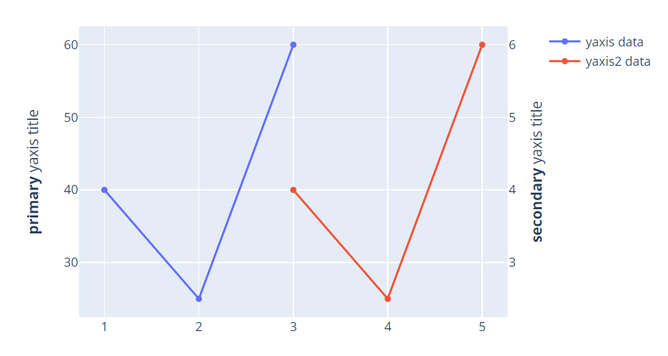
If you write the above flow as an actual code, it will look like this! In fig.update_yaxes, you can add a title for the y-axis, and here too, you can control whether the title is added to the primary axis or the secondary axis by setting secondary_y to False or True!
# ① import make_subplots
import plotly.graph_objects as go
from plotly.subplots import make_subplots

# ② Set whether or not to show the second axis.
fig = make_subplots(specs=[[{"secondary_y": True}]])

# ③ Set primary and secondary axes when describing a graph.
# Graph1
fig.add_trace(
    go.Scatter(x=[1, 2, 3], y=[40, 25, 60], name="yaxis data"),
    secondary_y=False,
)

# Graph2
fig.add_trace(
    go.Scatter(x=[3, 4, 5], y=[4, 2.5, 6], name="yaxis2 data"),
    secondary_y=True,
)

fig.update_yaxes(title_text="<b>primary</b> yaxis title", secondary_y=False)
fig.update_yaxes(title_text="<b>secondary</b> yaxis title", secondary_y=True)

fig.show()
Setting multiple axis
Using the Low-level API, we can display even more than two, even multiple axes! Below is an example of that, trying to write a graph with four axes, you could write something like the figure below!
As for the code, it is written with reference to https://plotly.com/python/multiple-axes/. Descriptive part of the graph
Descriptive part of the graph
import plotly.graph_objects as go

fig = go.Figure()

fig.add_trace(go.Scatter(
    x=[1, 2, 4],
    y=[2, 0.5, 1],
    name="y 1"
))

fig.add_trace(go.Scatter(
    x=[2, 3, 5],
    y=[20, 5, 10],
    name="y 2",
    yaxis="y2"
))

fig.add_trace(go.Scatter(
    x=[4, 5, 7],
    y=[20000, 5000, 10000],
    name="y 3",
    yaxis="y3"
))

fig.add_trace(go.Scatter(
    x=[5, 6, 8],
    y=[200000, 50000, 100000],
    name="y 4",
    yaxis="y4"
))
Setting about layout
If the axis labels are displayed as they are, they will be clustered on the left side of the graph, so they need to be shifted to make the display easier to understand. In the following code from https://plotly.com/python/multiple-axes/, the axis labels are placed on the right side or the left side of the graph by specifying the side, and the axis ticks and titles are colored so that they can be easily recognized. Translated with www.DeepL.com/Translator (free version)
fig.update_layout(
    xaxis=dict(
        domain=[0.3, 0.7]
    ),
    yaxis=dict(
        title="y 1",
        titlefont=dict(
            color="#1f77b4"
        ),
        tickfont=dict(
            color="#1f77b4"
        )
    ),
    yaxis2=dict(
        title="y 2",
        titlefont=dict(
            color="#ff7f0e"
        ),
        tickfont=dict(
            color="#ff7f0e"
        ),
        anchor="free",
        overlaying="y",
        side="left",
        position=0.15
    ),
    yaxis3=dict(
        title="y 3",
        titlefont=dict(
            color="#d62728"
        ),
        tickfont=dict(
            color="#d62728"
        ),
        anchor="x",
        overlaying="y",
        side="right"
    ),
    yaxis4=dict(
        title="y 4",
        titlefont=dict(
            color="#9467bd"
        ),
        tickfont=dict(
            color="#9467bd"
        ),
        anchor="free",
        overlaying="y",
        side="right",
        position=0.85
    )
)

fig.show()