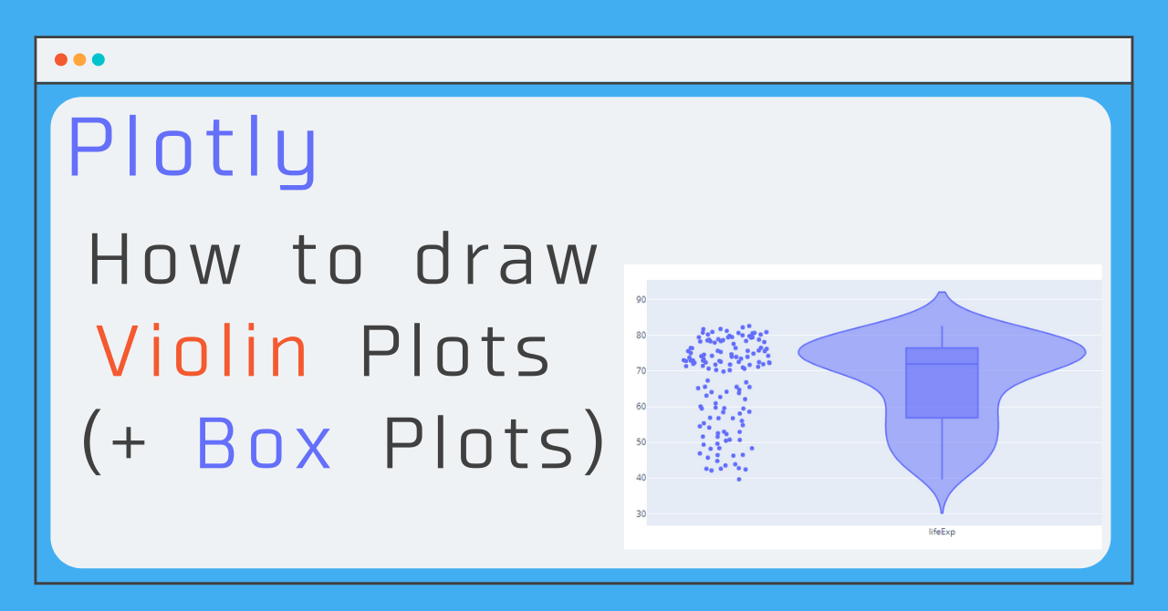
In this article, I'll show you how to draw a Violin Plot (violin diagram) using go. What is a violin plot anyway? In this article, I will show you how to draw a Violin Plot using go.Violin().
What is violin plot ?
The Violin Plot is a method of visualizing the distribution of numerical data, similar to the box-and-whisker plot. Concretely, it is a plot of the result of kernel density estimation, and it is said to be so named because its shape resembles a violin.
The box-and-whisker plots are often drawn together, and Plotly has an option to display the box-and-whisker plots on top of each other or not!
Estimation method by considering the normal distribution for each data point, adding them, and then normalizing so that the sum is 1
These are the three things you need to know how to write!
The Violin Plot graphs have many detailed settings and options, but here I'll show you a select few that you should at least know how to write! By following these three steps, you can draw the diagram below! (This figure shows the average life expectancy (lifeExp) by country as a Violin Plot. If you hover the cursor over the dot on the left, you can see which country's life expectancy the dot represents, and you can see that the countries on the upper side are the developed countries.)
1. y : Set values
The other two are optional and can be drawn without them, but they are the only required values for Violin Plot. Specify the list (or column, if it is a data frame) where you want to see the distribution of the data!
y = "List or series of values to be displayed"
#(Example)
y = df['price']
2. box_visible : Display a boxplot
By setting this to True, you can draw a box-and-whisker diagram as well!
box_visible = True3. points : display plots
If you want to display each data point as well as the data distribution, you can set points to 'all' to display all points!
points = 'all'Sample Code
In the figure above, I had made the three settings summarized so far, and added two more settings to make the graph easier to understand, and I've included the code for the whole thing!
The positive two settings are options common to all graphs, "name" and "text".
name : Set the legend for each graph
text : Set additional text information to be displayed when plotting points
(In this case, we added the country string information!)
# average life expectancy by continent
import pandas as pd
import plotly.express as px
import plotly.graph_objects as go

# Data preparation
df = px.data.gapminder()
df_2007 = df[df['year']==2007]

# Draw a graph
fig = go.Figure()
fig.add_trace(
    go.Violin(y= df_2007['lifeExp'],
              box_visible=True,
              points='all',
              name = "lifeExp",
              text = df_2007['country']
             )
)

fig.update_layout(yaxis_zeroline=False)
fig.show()
Draw multiple Violin plots + α settings
In this article, I have focused on the minimum points to be kept in mind. But when you are actually looking at data, you are more likely to want to draw and compare the distributions of multiple data rather than looking at the distribution of single data, so I will summarize the theme of displaying and comparing the distributions of multiple data! So, I'm going to summarize the theme of this article! The subject is the same as above, life expectancy by country, but it would be easier to analyze it if it could be divided by region, as in the figure below! I've been working on this for a few years now.
x Setting the horizontal axis
You can see how to display multiple graphs side by side here (Plotly Multiple Graphs Side by Side Display Multiple Graphs Side by Side (make_subplots, set_subplots)), but with Violin plot, you just need to set x! The setup here is that x is a list of the same size as y, and you need to set x as the label corresponding to each point in y. Incidentally, the following is a tip I use when I want to draw multiple violin plots from a data frame.categories = df['The column you want to set as the horizontal axis'].unique()
for cat in categories:
x = np.full(len(df),cat) meanline_visible : Display the average value
With box_visible, the median of the boxplot is shown, but the mean is not! So with this option, we can show the mean!meanline_visible=Trueopacity
Set the transparency (default is 1 and can be set from 0 to 1)Sample Code
# average life expectancy by continent
import pandas as pd
import numpy as np
import plotly.express as px
import plotly.graph_objects as go

# Data preparation
df = px.data.gapminder()
df_2007 = df[df['year']==2007]

# Draw a graph
categories = df_2007['continent'].unique()
fig = go.Figure()
for cat in categories:
    fig.add_trace(go.Violin( x = np.full(len(df_2007),cat),
                             y= df_2007[df_2007['continent']==cat]['lifeExp'], box_visible=True,
                             meanline_visible=True,  opacity=0.6,
                             name = cat,
                             text = df_2007[df_2007['continent']==cat]['country'],
                             points='all'))

fig.update_layout(yaxis_zeroline=False)
fig.show()
